Open-World Map Design Explained: Towers, Icons, Fog and Points of Interest
Why open-world games use towers, map fog and icon-filled maps, how landmarks guide you, and why many series moved toward less HUD-driven exploration.
Open your map in almost any big open-world action game and you will see the same visual language: a landscape partly hidden or greyed out, clusters of icons marking things to do, and a handful of towers, viewpoints or relay stations that promise to reveal more. These conventions are so familiar that they are easy to take for granted, but each one exists to solve a specific design problem. A world that takes dozens of hours to cross needs some way to tell the player where to go — or to encourage them to find out on their own.
This article breaks down the main tools open-world games use to reveal and organize their maps, using examples from Assassin’s Creed, Far Cry, Red Dead Redemption 2 and Marvel’s Spider-Man, and explains why the genre has gradually shifted toward less hand-holding.
The core problem: too much world, too little direction
A linear game controls where you are at all times, so it can pace its story and challenges precisely. An open world gives that control up. That creates three related problems for designers:
- Orientation. Players need to know where they are and how areas relate to each other.
- Motivation. A huge empty landscape is not inherently interesting; players need reasons to go somewhere.
- Prioritization. When there are hundreds of activities, players need help deciding what to do next — or at least to see what exists.
Every map system discussed below is an answer to some combination of those three. As our genre explainer notes, the split between main missions and optional side content is central to open-world action games, and the map is where that split becomes visible.
Towers and viewpoints: revealing the map one region at a time
The most recognizable map-reveal device is the tower. You climb or activate a structure, and the surrounding region’s details and activities appear on the map.

Assassin’s Creed viewpoints
The original Assassin’s Creed (2007) built the idea into its fiction. High points across the city act as viewpoints; climbing one and “synchronizing” reveals the area around it, with a sweeping camera move that shows off the city. Afterward, you can dive from the top into a pile of hay — the leap of faith. Viewpoints remained a fixture across the series, including in later entries where they also double as fast-travel points.
The design is clever because it makes orientation physical. To synchronize, you must look out over the area from above, which teaches you its landmarks and layout before you ever walk through it.
Far Cry’s radio towers
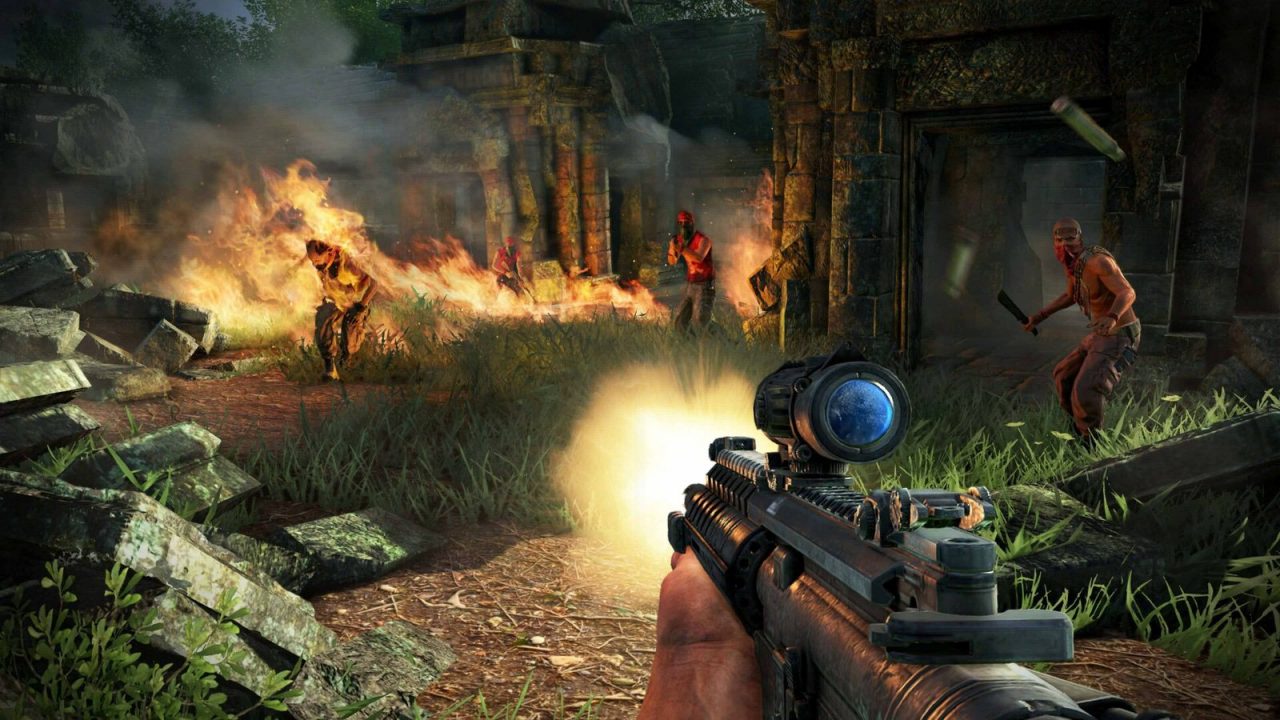
Far Cry 3 (2012) translated the idea into its own setting. Radio towers scattered across the Rook Islands needed to be climbed and disabled, revealing the surrounding map and unlocking free weapons at shops. Many towers were partly broken, turning the climb into a small platforming puzzle. Far Cry 4 continued the approach with bell towers held by Pagan Min’s forces.
Spider-Man’s surveillance towers
Marvel’s Spider-Man (2018) uses a variation. Early in the story, police contact Yuri Watanabe asks Spider-Man to restore Oscorp surveillance towers that have been hacked. Repairing a tower — via a short signal-matching minigame — reveals the surrounding district’s details and side activities. Because Spider-Man’s traversal is so fast, the towers function less as obstacles and more as a quick way to unlock each neighborhood’s content.
Why towers became controversial
Towers solve all three problems at once, which is why they spread. But they also produce a recognizable pattern: climb tower, reveal icons, clear icons, move to next tower. Once players learned that loop, the reveal stopped feeling like discovery and started feeling like a checklist. By the mid-2010s, “Ubisoft towers” had become a shorthand in criticism for a formulaic open world, even though the company’s own designers were already moving away from them.
Fog, greyed-out maps and discovering by moving
The alternative to revealing a map from a tower is revealing it by traveling through it. Many games hide or grey out regions the player hasn’t visited, then fill them in as they explore. This is sometimes called “fog of war,” borrowing a term from strategy games.
Red Dead Redemption 2 (2018) is a well-known example of this softer approach. There are no towers. The map fills in as Arthur Morgan rides through the territory, and many points of interest — strange characters, hidden cabins, unusual landmarks — never receive an icon until you physically stumble across them. Directions to some locations come through conversation, treasure maps or newspapers rather than markers.
Far Cry 5 (2018) took a similar step for its series. It dropped radio towers entirely; you learn about locations through road signs, characters who mention places in conversation, and simply seeing them from the road. Progress in each region is measured by a resistance meter that fills through any activity, not by systematically clearing a map.
The trade-off is that exploration-driven reveals can leave players lost, especially early in a game. Designers usually compensate with a strong main questline that pulls players through the world’s major regions, so the map is partly revealed whether you seek it out or not.
Map icons and density: how much is too much?
Icons are the map’s way of making promises. Each one signals “something worth doing is here,” whether that is a collectible, a side mission, an enemy camp or a shop. The question designers wrestle with is density.
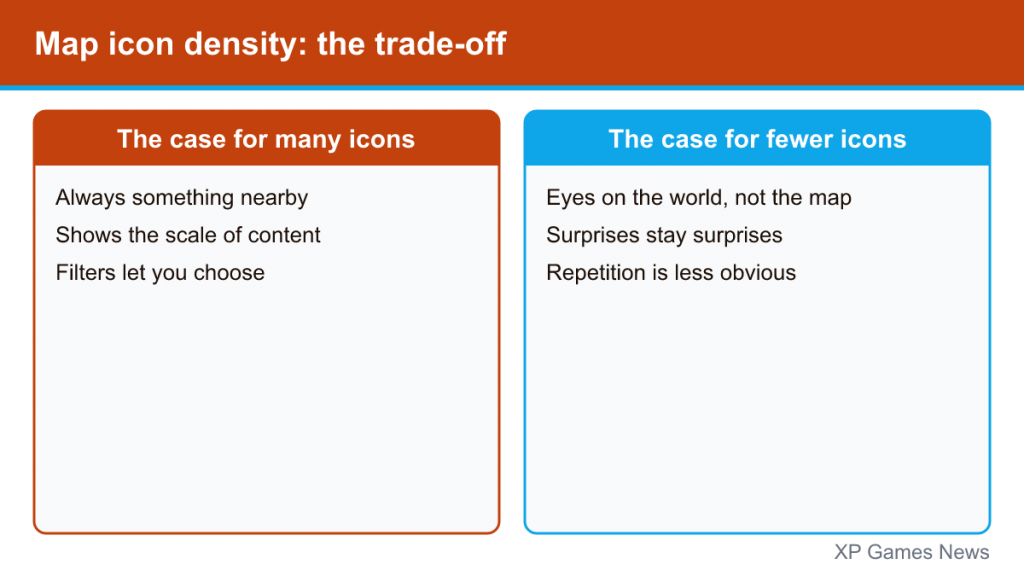
The case for many icons
- Players can always find something to do nearby, which is good for short play sessions.
- Icons communicate the scale of the content and help players who like completion goals.
- Categorized icons (with filters) let players choose the kind of activity they want right now.
The case for fewer icons
- A map covered in markers tends to make players look at the map instead of the world.
- Icons spoil surprises: if you know there is a treasure chest behind the waterfall, finding it is no longer a discovery.
- Large numbers of similar activities expose repetition.
Most modern games aim for a middle ground. Major story and side missions are marked, while smaller secrets are left unmarked or are revealed only once you get close. Filters and toggles let players hide categories they do not care about. If you are following a long series like the ones covered in our Assassin’s Creed order guide, comparing an early entry’s map with a recent one is a quick way to see how icon philosophy changed over time.
Landmarks and sightlines: navigating by the world itself
The best open-world maps are designed so you rarely need to open them. Landmarks — a tall building, a mountain peak, a distinctive bridge, a lighthouse — give players reference points they can see from far away. Designers place them deliberately so that they are visible from many parts of the map, and so that moving toward one tends to lead past other interesting places.
Several techniques recur:
- Weenies. A term borrowed from theme-park design for a tall, eye-catching object that draws visitors toward it. In open worlds, a castle on a hill or a smoking chimney in the distance does the same job.
- Breadcrumbs. Smaller points of interest — a campfire, a wrecked wagon, a column of birds — lure players off the road and into side content.
- Elevation reveals. Climbing gives a view over the surroundings, which is why high ground is so often rewarded with a visual payoff, whether or not a tower is involved.
- District identity. City-based games give each neighborhood a distinctive look so players know where they are at a glance — Spider-Man’s Manhattan, for instance, differentiates districts like Harlem, Midtown and the Financial District through architecture and atmosphere.
Good landmark design also makes towers less necessary. If you can see the world clearly and read it, you need fewer artificial reveals.
The shift toward less HUD-guided exploration
Since the mid-2010s, many open-world action games have offered ways to explore with fewer instructions on screen.
Assassin’s Creed Odyssey’s Exploration Mode
Assassin’s Creed Odyssey (2018) introduced a choice at the start between Guided Mode and Exploration Mode. In Guided Mode, quest objectives are marked precisely, much like earlier entries. In Exploration Mode, exact markers are removed and the game instead gives you clues — a region, a landmark, a direction — and expects you to search, often using the eagle Ikaros to scout. Ubisoft described Exploration Mode as the way Odyssey was meant to be experienced. The content is the same in both modes; only the guidance changes.
HUD options and minimal interfaces
Many games now let you turn off the minimap, objective markers or other HUD elements. Red Dead Redemption 2, for instance, offers extensive HUD settings and a cinematic camera mode while riding, which encourages players to look at the landscape rather than the minimap.
In-world guidance
Another approach replaces markers with objects that exist inside the fiction: road signs, written directions, a companion who knows the way, or a map that the character physically holds. Far Cry 2 (2008), where the mercenary pulls out a physical map and GPS unit that stay visible in the game world, is an early example.
Common design mistakes and what players notice
- Icons without variety. When dozens of markers turn out to be the same activity, the map starts to feel like a chore list.
- Empty space without purpose. Large distances are fine if they create anticipation or atmosphere, but they need occasional rewards along the way.
- Reveals that undercut exploration. If every secret appears on the map after climbing one tower, there is little reason to explore the area on foot.
- Too little guidance at the start. Players who are dropped into a hidden map with no landmarks or objectives often bounce off before the world opens up.
Most of these come down to the same principle: the map should support exploration, not replace it. Far Cry’s own evolution, which our Far Cry series guide traces from the 2004 original to Far Cry 6, is a good case study of a franchise adjusting this balance from one game to the next.
How to get more out of an open-world map
If you want exploration to feel fresher, a few habits help regardless of the game:
- Turn off or reduce markers for minor activities if the game allows it, and keep only story objectives visible.
- Pick a visible landmark and travel toward it without opening the map, stopping for whatever catches your eye along the way.
- Avoid fast travel in the early hours, when learning the layout pays off most.
- Use towers or viewpoints for the view, not just the icons — they are often placed to show off the region’s best sights.
None of these change the game’s content, but they change how you meet it — which, in the end, is what map design is really about.